

Give Me A Snack Break
The comic world suffered the loss of two individuals this week. The first is cartoonist and illustrator Jack Davis best known for his work with MAD magazine. He also did things for movie posters, TV Guide covers, and yes, he even did artwork for Topps chewing gum’s Wacky Pak series. A very talented artist with a very long and illustrious career. I didn’t know much about him but little did I know, I admired his work.
The second cartoonist we lost was Richard Thompson.
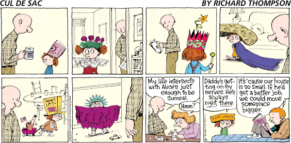
Richard did a comic strip called Cul de Sac. It was a strip about kids. The strip featured a preschooler named Alice Otterloop, here neurotic older brother Pete, her mother and father, and a cast of several of her fellow preschoolers who all go to the Blisshaven preschool. It ran in syndication from 2007 to 2012 to a fairly decent audience. I ran into the strip around 2010…
and I hated it. Downright hated it.
Not because the writing was bad, or because the characters weren’t engaging. I wouldn’t know, I never read it. I hated it because it was, in my opinion, poorly drawn. You see, I’m a visual person, and the first thing I focus on in a comic strip, is how it looks. So when I saw how it was drawn, with those loose squiggly lines and sloppy hand lettering, I never read it. Didn’t even give it the time of day. So I moved on.
In 2009 at the age of 52, Richard was diagnosed with Parkinson’s disease. A disorder that effects the central nervous system and robs people of their motor skills. The most well known side effect is shaking, but in the later stages can also offer issues with thinking, dementia, depression, and other emotional issues. Despite this, Richard forged on continuing to write and draw his comic strip.
In 2012, he announced he was ending the strip due to complication of his Parkinson’s and it sent a wave though the comic strip world. I didn’t get it. Although tragic in it’s own right, I couldn’t understand why everyone was mourning the loss of this comic strip. So I bit the bullet and I took another look at Cul de Sac.
The more strips I read, the more I realized how brilliant the strip actually was. Still drawn roughly in his loose style, but I noticed how wonderfully written it was. The humor was subtle and witty and each character had been given wonderful traits as quirky as Richards drawing style. It was then I realize how I misjudged the strip simple because of how it looked to me. It was then I regretted not giving it more of a chance back when I first found it because it was visually displeasing to me.
Now I could give you some analogy about how we shouldn’t judge a book by it’s cover or how we should look beyond the rough exterior to see the beauty underneath. That’s not my take away. that’s too easy. My take away is more basic and more technical.
Simply this: A comic strip is filled with characters. Like a movie or a TV show, the characters are cast by the artist with each character adding something to the strip. Through their personality and their dialog, it gives a vehicle for the humor in that strip. Each character delivering a line or a joke selected just for him in a way that only he could make it funny. But there’s more to the cast list of a strip then the cast. There’s the strip style. The style of the line work and how it’s drawn. There’s the way the lettering is done, how the strip is colored and what colors are used. Each one of these aspects adds to the strip as if it were a cast member hired by a casting agent to act out a role. Cul de Sac was written about kids. Drawn to give that flavor of childlike humor. To look like a kid might have drawn it and lettered to read like the dialog kid if maybe you could physically see the words a kid would say. If the strip had been drawn with more controlled lines and cleaner lettering, it would have diluted the feeling of the strip. I wouldn’t have been Cul de Sac. And I missed that aspect. Shame on me.
Like I said, nothing earth shattering here, just basic observations. My main point is, the next time you read a comic strip, mine or someone else’s, take a few extra seconds to take a closer look at it. The line work, the lettering, colors, and see how it effects the overall flavor of the strip. The average reader spends approximately 5 seconds reading and looking at a comic strip then moves on. Sometimes the subtleties get missed in those furious seconds of engagement. Just remember that nothing in these comics we all draw for you readers happens by chance. Everything is there for a reason, even if we don’t see it ourselves.


oooohhhhhhh…. pretty colors…. 5 seconds are up
Good. Get out.
im gone
Snacks for Snakes. Go forth & munch Carl ‘cos it could be your last chance if the Monster gets you.
Snacks for snakes. that’s cute.